PROJECT GOALS:
The client needed a website but had no idea how she wanted it to look like. She had hired a web developer, who provided a design proposal and she wasn't satisfied with the results. It felt impersonal and generic. Apart from the generic layout and color scheme, the developer used stock photos and icons. This is what the old layout looked like:
SOLUTIONS:
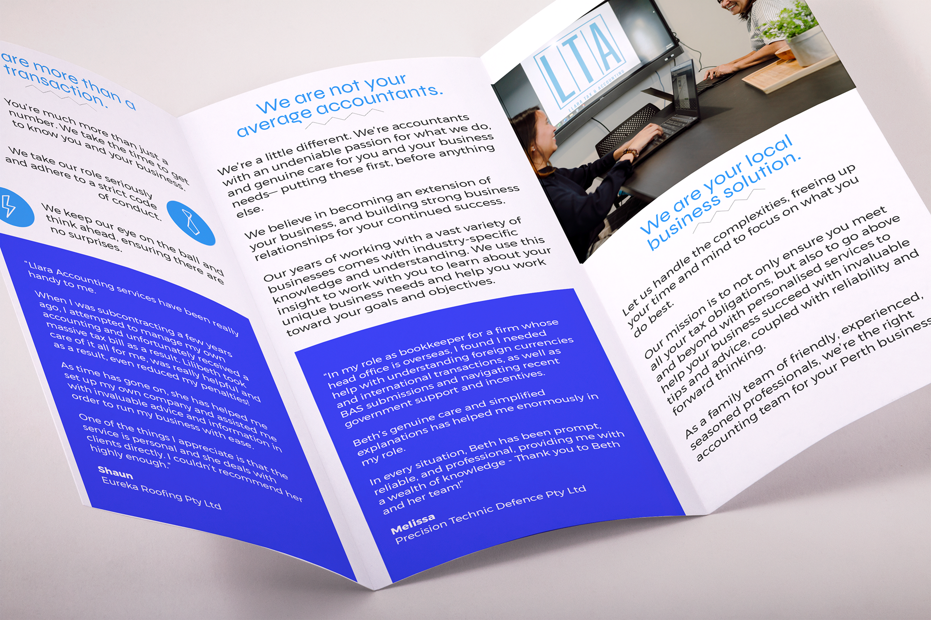
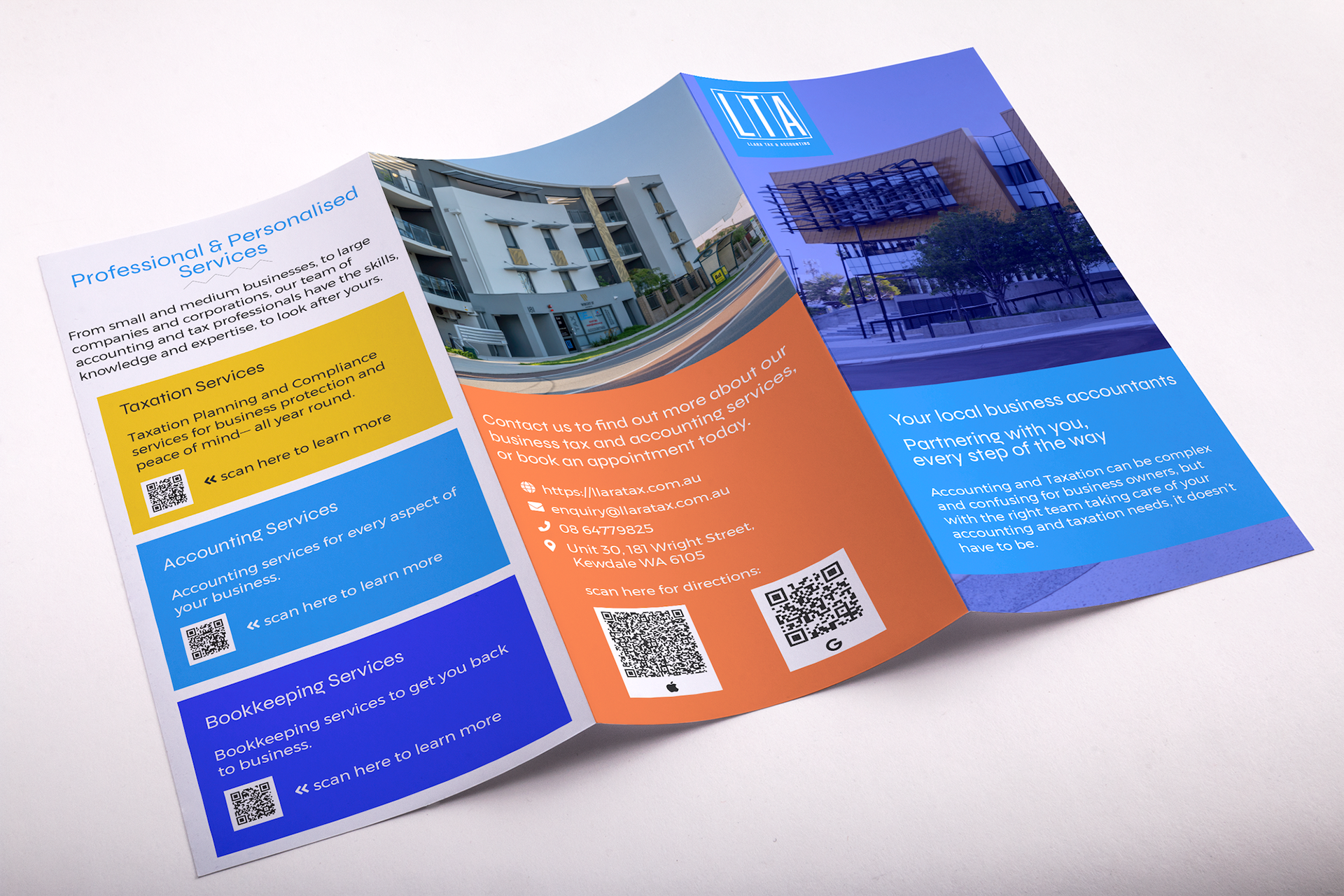
In terms of the visual branding, all they had was a logo and nothing more. They didn't have an official colour scheme or typeface. So I started by getting to know their brand better through my discovery process. I asked about what sets them apart and what they want their clients to know about them as a business. They have a growing reputation of being a friendly, neighbourhood accounting firm and they wanted to build on that reputation. They wanted to be *the* friendly neighbourhood accounting firm and build a strong local client base. Armed with this information, I designed their website with a bright and friendly colour scheme, iconography, and typeface. I also added emphasis to the locale by featuring local sights. To highlight their friendliness and to built trust, I added professional photos of the team behind the business. I then used the website as the visual anchor for the rest of the marketing collateral that they needed. Here are the results:

